Green Hills Analysis

Friday 25 November 2016

DHFL MEDIUM TERM INVESTMENT


Hello Guys , This DHFL Chart which is in Up Trend . Presently this stock is in correction phase 
and now its has given me a buy signal according to my Investing Strategy and it can made a new Swing high up to  450  presently this stock is trading in  238 to 240 levels . 

IF YOU INVEST 10,000 IN THIS STOCK 
YOU WILL GET 40% RETURN IN 2 -3 MONTHS
MEANS 4000 RUPEES
AND IF YOU LOOSE YOU LOOSE
ONLY 1000 RUPEES.......

Wednesday 16 November 2016

Indian Index Intermarket Analysis Overview :-

Lets Start with USD/INR :-
1) Overall Trend is Bullish.
2) Made a Bullish Continuation Pattern and Given Breakout signal.
3) Traingle Range Target is 70 accordingly Classical Charting .

NIfty50 Index :-
1) Overall All Trend Now Changed to Bearish (1st Lower high Formation) .
2) Bearish Wedge Pattern Formation and Now Given the Breakout.
3) Island Top Reversal at the Top and Head and Shoulder Reversal Forms.
4)Target 6500 of this index According to Fibonacci Extension 1.27.

US Dollar Index :-
1) Trend is Up .
2) Made a Trend Continuation Range Pattern which is likely to go Up.
3) Targeting 108 as Range Cloned to Upside .

Thursday 22 September 2016

CIPLA LONGTERM SELL SETUP FOR VALUE INVESTORS


The Above Chart is Of Cipla Ltd 

As We got Some DisCeration Analysis :

  • As we see on the Weekly Chart , Price already Reversed in 2015 by making the Double Top pattern and Touched the Fib extension 1.61 and then Revesed .
  • Now present time Price Took Support From its main Longterm TL and now price is Moving forward up to Neckline or RRL + FIB 0.618 . I hope we will definitely see Bearish Price Action in weekly Chart in Few months .
  • Any Bearish PA Leads to Massive Decline in price up to FIb Extension 1.27 that is Leg D.

We have Already in the Long Position But Will Reverse our position Soon .

Thursday 28 July 2016

OUR LONGTERM VIEW IN NIFTY PURE TECHNICAL


IN 2008 WHEN NIFTY TOOK SUPPORT FROM 2200 S LEVEL
WHERE WE GOT STOCH INDICATOR GOT OVERSOLD
AND MADE A TRIANGLE OF CONSOLIDATION FROM 2200 S TO 3200 S WE GOT A BREAKOUT AND THEN MARKET RIDE
ABOUT 3100 POINTS.

NOW IN 2016 SAME SITUATION WE GOT WHERE MARKET TOOK SUPPORT LEVEL FROM 6800 S LEVEL
 AND THE INDICATOR STOCH SHOWED OVERSOLD AND MARKET RIDE FROM 6800 TO 8600
 AND WE ARE ANTICIPATING IT TO THE LEVEL 9700 S TO 10,400 S LEVEL
2ND CONFLUENCE WE GOT IS THAT THE FIB EXTENSION 1.27 &1.67 AND TRIANGLE RANGE TARGET .
SO MY LONG TERM TARGET OF NIFTY WILL BE IN THE RANGE OF 9700 S TO 10400 S

I THINK YOU GUYS LIKE IT .....

Monday 20 June 2016

Saturday 18 June 2016

Bharti Airtel Weekly View And Buy Setup


Hello Guys !...The above Chart is the Bharti Airtel Daily Chart .
Stock is retracing from the month of  may it get a strong bottom at the zone and fib 78.6 @ 336 -340
which creates momemtum 2 times recently and i got a Bullish trangle Setup  so on break of trangle i anticipate it will lead prices all the way to 396 to 400 level where i got may confluence to cover the long positions ..

SBIN Weekly view and Sell Setup


Hii Guys ..This is  the Sbin Weekly time frame chart. I got a historical trendline which has 2 touches in past and i expected that it will also reject the price this time also there  are also 2 other confluence for sell is Fib 61.8 and 78.6 zone  and a Role Reversal level (RRL) @ 220-224 zone .I will 
see further Sell PA on Sbin  If it will not crosses 224 level .Any Bearish PA will lead to Big fall in prices 

Thursday 16 June 2016

Tuesday 14 June 2016

Cipla Buy Trade


Buy Cipla For the Target 498
Stoploss 480

Still Paying High brokrage for old Method of trading ?

Picover
Traders,
Advanced charting without any cost for data is one of the big pluses of Pi. We have 10 chart types with over 80 indicators. Over the last few months, our clients testing Pi have requested for a lot more indicators. We will start adding them soon. This post will talk about all the basics of using charts on Pi.
If you want to learn more about Technical Analysis, get onto Zerodha Varsity.

Invoking a Chart

There are three easy ways to invoke a chart.
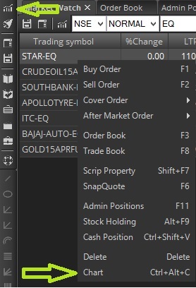
  • Right click on the scrip on your marketwatch, and choose Chart
  • Use the shortcut key Shift+C
  • Use Create new chart icon
chart1
Invoking the chart

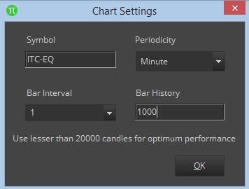
Selecting a time frame

You can currently open minute, hour, and day charts. Intraday charts are available for up to 6 months, and day charts for over 5 years (top 150 stocks and indices). We will add more data and stocks to this soon. F&O charts are available only for as long as that contract has been live. We suggest looking at the underlying stock/indices charts for much longer historical analysis. And yes, we also have options charts from when the contract has started trading.
Once you invoke the chart, you can use this box for selecting the time frame. You can open upto 50,000 candles based on your system speed and configuration, but we suggest using lesser than 20,000 especially when trading. If you request for more bar history than what is available  it will display the chart from when the data is available.
chart2
Select time frame
If you want a 1-minute chart, use like the image above. If you want a 5-minute chart, change the bar interval to 5 but keep the periodicity as minute. If you want a 1-hour chart, change periodicity to hour and bar interval to 1. Similarly for Day chart, change periodicity to day and interval to 1. If you want a day chart for the last 1000 days (bars), keep the bar history as 1000. If you want the last 10,000 1-minute candles, keep the bar history as 10,000.
Note: If you want to change the time frame for a particular chart, you can’t do this directly, you have to follow the same process as described above. With Pi, you can invoke charts of multiple time frames at the same time unlike other platforms where you can have only 1 chart per contract.
The chart might take some time to load if you are requesting for larger bar history.Check this video on loading charts of different time frames.

Chart types & Indicators

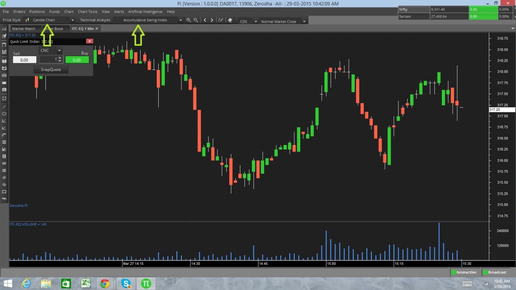
We have 10 chart types and over 80 indicators. The default chart type is candlesticks, and you can use the price style and technical analysis dropdown for selecting chart type and indicator respectively. Note that these two dropdowns get enabled only if you have a chart open.
chart3
Selecting Chart types and indicators
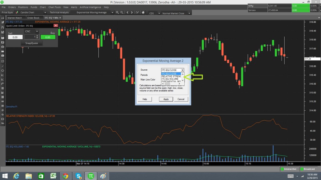
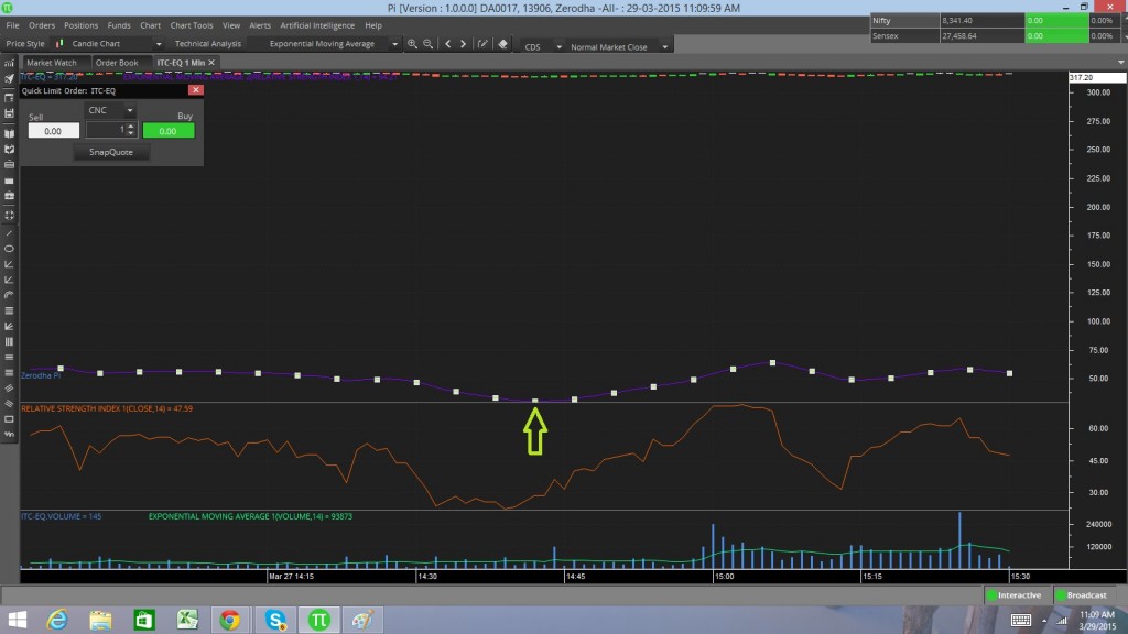
You can add an indicator on Open, High, Low, Close, Volume, or another indicator as shown below. (In the pic below, we have added an EMA on volume, and now trying to add EMA on RSI). Check this video.
chart4
Adding indicator on O,H,L,C, Vol, and another indicator
When you are trying to add an indicator on an indicator, it is possible that it gets added to the main price panel, instead of the panel in which the indicator is. If this happens, click on the indicator, you see white square boxes. Left click on the white box and drag it to the panel you want it on.
chart5
Dragging the indicator on correct panel.

Deleting an Indicator

In the pic above, once you have clicked on the indicator press the delete button to remove the indicator.

Viewing OHLC and Volume of a Candle

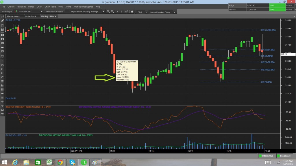
To check the OHLC and Volume (tooltip) of a candle, left click anywhere on the chart and hover your mouse over the candle keeping your mouse clicked as shown below. You can also check this video.
chart7
Watching O,H,L,C, and Volume

Drawing tools

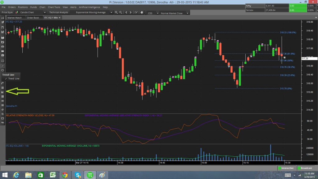
We currently have over 14 drawing tools, from trend lines to Fibonacci retracement. We will keep adding more. To use any of the drawing tools all you need to do is select it from the left panel as shown below and then draw based on where you want it.
chart6
Over 14 drawing tools

Zoom in and Zoom out

Pi has shortcut keys for almost everything, but for regular everyday actions we’ve tried to make it even more simpler. You can use the up/down arrow keys to zoom in and zoom out. You also have the zoom in/zoom out buttons on top of the chart. You can even right click on the chart and decide to “Complete Zoom Out” or “Zoom Selected Area”. Check out this video to see how it’s done.

Scroll Left and Right

Scrolling through a chart is possible by using the right and left arrows on your keyboard. Alternatively, you can scroll using your mouse. Ideally, it’s best to use the up/down/right/left keys in coordination to arrive at the right point on your chart. If the point you’re scrolling to is very far, just right click and zoom out completely and then choose the portion of the chart you’d like to view and zoom in there.

Right click menu on the chart

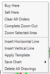
Right clicking on your chart opens up a lot of additional options as shown in the image below.

Right click on chart
Buy Here: You can buy directly from the chart. Yes, this is possible. View your chart in detail and decide exactly where your buy should happen.
Sell Here: You can sell directly from the chart without having to open an order form.
Clear All Orders: You can clear/cancel any open orders on the chart by choosing this option.
Complete Zoom Out: Use this option if you want to see all the available data on the chart.
Zoom Selected Area: Choose this option and click any two points on the chart and that portion gets zoomed in.
Insert Horizontal Line: Use this option if you want to draw a horizontal line to get your Support/Resistance lines.
Insert Vertical Line: Use this option to draw vertical lines on your chart.
Save Chart: You can save your chart as an image or even a template with all your indicators for future use.
Delete All Drawings: Delete all your drawings at once instead of clicking on each drawing and hitting the delete button.

Invoking an Index chart

First add the index on the marketwatch as shown below, and then follow the same steps like you would for any other scrip. You can open index charts for Nifty, Banknifty, CNXIT, among others.

Monday 13 June 2016

Sell Triggered in Apollo Tyres


In the Above chart we see that the stock is in the consolidation phase from the 2 weeks and now wee clearly see the breakout triggered from the level 150 that indicated that stock will see some downside pressure to the level 130 

Nifty Buy Setup


As you see in the above chart that Nifty is correcting its price from the level 8290 and taken support from the 20 Day Exponential Moving Average which clearly shows the the bulls are really controling the Market So in my opinion I will buy nifty above 8130 if it Sustain the level and My target would be 8310 

Thursday 9 June 2016

Sell Nifty For the Target 8000


In the above Chart you see that nifty is in a Very volatile trend which indicates Reversal.As you see that the daily chart shows the evening star formation ,Broken Daily insidebar and also broken the rising channel which clearly shows that the big correction is going to happen.

Sell Nifty For the target 8000

Tuesday 7 June 2016

Buy Biocon Above 728


Buy Biocon Above 728
Target 750
Stoploss 720

LT Long Triggered


LONG LT FOR THE TARGET 1540
STOPLOSS 1475

What is a 'Trend'

Trend


What is a 'Trend'

A trend is the general direction of a market or of the price of an asset, and trends can vary in length from short to intermediate, to long term.

As a general strategy, it is best to trade with trends, meaning that if the general trend of the market is headed up, you should be very cautious about taking any positions that rely on the trend going in the opposite direction. A trend can also apply to interest rates, yields, equities and any other market that is characterized by a long-term movement in price or volume.

Next Up

TREND ANALYSIS

TRENDING MARKET

TREND TRADING

BREAKING DOWN 'Trend'

The trend is your friend. This is rule of law for many traders. Following the trend is one way traders attempt to predict the future direction of an asset’s price.

Trend Analysis

By definition, trend analysis is based on historical price movements. As a result, it may seem to fit best under the jurisdiction of technical analysis. Technical analysis looks at historical trends and changes in price to determine the future direction of prices. By contrast, fundamental analysis looks at changes in the performance of an asset, such as earnings or revenue. That said, fundamental analysts can also look for trends in earnings per share and revenue growth. If earnings have grown for the past four quarters, this represents a positive trend. However, if earnings have declined for the past four quarters, it represents a negative trend.

Trend Lines

One tool traders use to identify a trend in stock price is the trend line. It is a line drawn between the high and low point for a stock over a period of time. If the stock price goes up from $10 to $20 to $30 over a three year period, the analyst can plot a line from $10 to $30 starting in year one and ending in year three. The first year marks the first plot in the series, it is the baseline price of $10. The second year represents the beginning of the trend at $20, and the third year marks the continuation, or possibly the end of the trend, at $30. In this way, trend lines can be used to either predict the next data point along the trend or look for a reversal of the trend.

Trend lines can also be used to form a channel marked by two lines. One line is created by trends in the highs for the stock. Another line is created with trends in the lows for the stock. The price is then expected to trade in a range between these two lines to form a channel.

Monday 6 June 2016

Buy Triggered in AdaniPorts


Buy AdaniPorts Stoploss 200
Target 209

ITC Trangle Setup


ITC did a very good breakout for the upside .as it consolidate on a resistance and also made Trangle pattern .So we take any decision on the break of trangle .

The Truth About Moving Averages

Not a day goes by in the media where the moving average of a particular investment isn’t referenced. Oftentimes, the market’s current level is referenced in terms of where its 200-day of 50-day moving average is, using that as a justification to buy or sell. Below the moving average? It’s a downtrend…sell, SELL! Above the moving average? It’s an uptrend…buy, BUY!! (For the uninitiated, read "How to Use a Moving Average to Buy Stocks?")

The truth is not anywhere near as elegant as these simple conclusions make it seem. Many people use moving averages as part of their analytical toolkit, but few have a true understanding of what the moving average actually tell you. As we show in our 2016 Dow Award winning paper “Leverage for the Long-Run” (click here to download), the moving average indicator doesn’t actually tell you anything about trend. If it did, then in the 1990s, 2000s, and current period bull market (three of the strongest “uptrends” in history), a strategy of buying the S&P 500 (SPY) when above the 200 day moving average and going into Treasury Bills when below should have substantially outperformed a do-nothing approach. In fact, nothing could be further from the truth, as a simple backtest proves.

So are moving averages then completely pointless to look at? Not at all. While the reasoning often referenced for following the moving average is to follow the “trend” (false), the moving average does help with risk mitigation (true). When trading above a moving average, an investment’s volatility tends on average to be lower than when below it.

Why does volatility matter? Because for the vast majority of investors, buy and hold is a fallacy. Volatility and fast moving declines in markets tend to scare money out of markets, causing drawdowns and loss of capital. Volatility management is crucial because it is volatility that causes emotional selling, which more often than not happens at the exact wrong time. (Related: read "Volatility's Impact on Market Returns.")

Your ability to stick to a strategy matters more than the strategy itself. To the extent that moving averages can help lessen that potential volatility in your portfolio, the truth is you should focus on it. Just understand first and foremost what the moving average tells you first.

Sunday 5 June 2016

Ambuja Cement Buy Setup


We have seen recent days that the stock have some selling orders in the level 232 to 233 thats why stock is unable to pull upside .I am anticipating that stock price will se some Correction till 222.5 level that i think a good buying zone because i got many confluences in that zone.

Bharti Airtel Head&Shoulder Setup


I got H&S Pattern Setup on Bharti Airtel A Stock is Moving in a range now it go rejection form the mid of the range.So i am anticipating that the stock will continue to move towards the lower range.

My ultimate Target for this stock is 290 


Apollo Tyres Sell Setup


I got a trangle Sell Setup on Apollo Tyres .Stock recently climbed to 181 which is a Fib 50% Retracement on weekly Chart and after 181 touched Impulsive selling taken place as you see in the chart stock is dipped in every ups So my first initial Target in this Stock is 130 which is also Psychological Level .

How Interest Rates Affect The Stock Market

The Interest Rate

Essentially, interest is nothing more than the cost someone pays for the use of someone else's money. Homeowners know this scenario quite intimately. They have to use a bank's money, through a mortgage, to purchase a home, and they have to pay the bank for the privilege. Credit card users also know this scenario quite well - they borrow money for the short-term in order to buy something right away. But when it comes to the stock market and the impact of interest rates, the term usually refers to something other than the above examples - although we will see that they are affected as well.
The interest rate that applies to investors is the Federal Reserve's funds rate. This is the cost that banks are charged for borrowing money from Federal Reserve banks. Why is this number so important? It is the way the Federal Reserve (the "Fed") attempts to control inflation. Inflation is caused by too much money chasing too few goods (or too much demand for too little supply), which causes prices to increase. By influencing the amount of money available for purchasing goods, the Fed can control inflation. Other countries' central banks do the same thing for the same reason.
Basically, by increasing the federal funds rate, the Fed attempts to lower the supply of money by making it more expensive to obtain.

Effects of an Increase

When the Fed increases the federal funds rate, it does not have an immediate impact on the stock market. Instead, the increased federal funds rate has a single direct effect - it becomes more expensive for banks to borrow money from the Fed. Increases in the federal funds rate also cause a ripple effect, however, and factors that influence both individuals and businesses are affected.
The first indirect effect of an increased federal funds rate is that banks increase the rates that they charge their customers to borrow money. Individuals are affected through increases to credit card and mortgage interest rates, especially if they carry a variable interest rate. This has the effect of decreasing the amount of money consumers can spend. After all, people still have to pay the bills, and when those bills become more expensive, households are left with less disposable income. This means that people will spend less discretionary money, which will affect businesses' top and bottom lines (that is, revenues and profits).
Therefore, businesses are also indirectly affected by an increase in the federal funds rate as a result of the actions of individual consumers. But businesses are affected in a more direct way as well. They too borrow money from banks to run and expand their operations. When the banks make borrowing more expensive, companies might not borrow as much and will pay higher rates of interest on their loans. Less business spending can slow down the growth of a company, resulting in decreases in profit.

Stock Price Effects

Clearly, changes in the federal funds rate affect the behavior of consumers and businesses, but the stock market is also affected. Remember that one method of valuing a company is to take the sum of all the expected future cash flows from that company discounted back to the present. To arrive at a stock's price, take the sum of the future discounted cash flow and divide it by the number of shares available. This price fluctuates as a result of the different expectations that people have about the company at different times. Because of those differences, they are willing to buy or sell shares at different prices.
If a company is seen as cutting back on its growth spending or is making less profit - either through higher debt expenses or less revenue from consumers - then the estimated amount of future cash flows will drop. All else being equal, this will lower the price of the company's stock. If enough companies experience declines in their stock prices, the whole market, or the indexes (like the Dow Jones Industrial Averageor the S&P 500) that many people equate with the market, will go down.

Investment Effects

For many investors, a declining market or stock price is not a desirable outcome. Investors wish to see their invested money increase in value. Such gains come from stock price appreciation, the payment of dividends - or both. With a lowered expectation in the growth and future cash flows of the company, investors will not get as much growth from stock price appreciation, making stock ownership less desirable.
Furthermore, investing in stocks can be viewed as too risky compared to other investments. When the Fed raises the federal funds rate, newly offered government securities, such Treasury bills and bonds, are often viewed as the safest investments and will usually experience a corresponding increase in interest rates. In other words, the "risk-free" rate of return goes up, making these investments more desirable. When people invest in stocks, they need to be compensated for taking on the additional risk involved in such an investment, or a premium above the risk-free rate. The desired return for investing in stocks is the sum of the risk-free rate and the risk premium. Of course, different people have different risk premiums, depending on their own tolerances for risk and the companies they are buying into. In general, however, as the risk-free rate goes up, the total return required for investing in stocks also increases. Therefore, if the required risk premium decreases while the potential return remains the same or becomes lower, investors might feel that stocks have become too risky, and will put their money elsewhere.

The Bottom Line

The interest rate, commonly bandied about by the media, has a wide and varied impact upon the economy. When it is raised, the general effect is a lessening of the amount of money in circulation, which works to keep inflation low. It also makes borrowing money more expensive, which affects how consumers and businesses spend their money; this increases expenses for companies, lowering earnings somewhat for those with debt to pay. Finally, it tends to make the stock market a slightly less attractive place to investment.
Keep in mind, however, that these factors and results are all interrelated. What is described above are very broad interactions, which can play out in innumerable ways. Interest rates are not the only determinant of stock prices and there are many considerations that go into stock prices and the general trend of the market - an increased interest rate is only one of them. One can never say with confidence, therefore, that an interest rate hike by the Fed will have an overall negative effect on stock prices.


Read more: How Interest Rates Affect The Stock Market | Investopedia http://www.investopedia.com/articles/06/interestaffectsmarket.asp#ixzz4AhF6tahj

BSE to auction investment limits for Rs 4,046-crore govt bonds

Leading stock exchange BSE will auction on Monday investment limits for overseas investors for the purchase of government debt securities worth Rs 4,046 crore.
The auction will be conducted on BSE’s e—bidxchange platform from 1530 hrs to 1730 hrs, after the close of market hours.
The debt auction quota gives overseas investors the right to invest in the debt, up to the limit purchased.
“Live bidding session for allocation of debt investment limits for FII/FPI/sub accounts shall be conducted on Monday, June 6, 2016, on exchange’s ‘ebidxchange’ platform,” BSE said in a circular.
A mock bidding session was conducted on Friday in this regard.
Last month, the government debt securities witnessed lukewarm response in an online auction after months of over-subscription. It had attracted bids worth Rs 2,957 crore from foreign investors as against securities to the tune of Rs 3,340 crore put on offer.
To boost inflows of foreign funds, the limit for overseas investors in central government was hiked to Rs 1.4 lakh crore from April 4, and it will be further increase to Rs 1.44 lakh crore from July 5. Earlier, the limit was Rs 1,35,400 crore.

Friday 3 June 2016

How To Trade Divergences

How To Trade Divergences

Now it’s time to put those Jedi divergence mind tricks to work and force the markets to give you some pips!
Here we’ll show you some examples of when there was divergence between price and oscillator movements.
First up, let’s take a look at regular divergence. Below is a daily chart of USD/CHF.
Regular Bullish Divergence on Daily chart of USD/CHF
We can see from the falling trend line that USD/CHF has been in a downtrend. However, there are signs that the downtrend will be coming to an end.
While price has registered lower lows, the stochastic (our indicator of choice) is showing a higher low.
Something smells fishy here. Is the reversal coming to an end? Is it time to buy this sucker?
Successful Bullish Divergence Trade
If you had answered yes to that last question, then you would have found yourself in the middle of the Caribbean, soaking up margaritas, as you would have been knee deep in your pip winnings!
It turns out that the divergence between the stochastic and price action was a good signal to buy. Price broke through the falling trend line and formed a new uptrend. If you had bought near the bottom, you could have made more than a thousand pips, as the pair continued to shoot even higher in the following months.
Now can you see why it rocks to get in on the trend early?!
Before we move on, did you notice the tweezer bottoms that formed on the second low?
Keep an eye out for other clues that a reversal is in place. This will give you more confirmation that a trend is coming to an end, giving you even more reason to believe in the power of divergences!
Next, let’s take a look at an example of some hidden divergence. Once again, let’s hop on to the daily chart of USD/CHF.
Hidden Bearish Divergence on Daily chart of USD/CHF

Here we see that the pair has been in a downtrend. Notice how price has formed a lower high but the stochastic is printing higher highs.
According to our notes, this is hidden bearish divergence! Hmmm, what should we do? Time to get back in the trend?
Well, if you ain’t sure, you can sit back and watch on the sidelines first.
Hidden Bearish Divergence on Daily chart of USD/CHF
If you decided to sit that one out, you might be as bald as Professor Xavier because you pulled out all your hair.
Why?
Well the trend continued!
Price bounced from the trend line and eventually dropped almost 2,000 pips!
Imagine if you had spotted the divergence and seen that as a potential signal for a continuation of the trend?
Not only would you be sipping those margaritas in the Caribbean, you’d have your own pimpin’ yacht to boot!

Thursday 2 June 2016

Intraday Sell Amaraja Bat

SELL Amaraja bat CMP Stoploss 843 Target 830

Building a Trading Plan

Building a Trading Plan

The key to becoming a successful forex trader is developing a sound forex trading plan and using it on a daily basis. One must remember that a trading strategy that may be working well for one person might not do the same for you. This is because everybody has a different style of thinking, risk tolerance levels and market experience. It is always better to develop one’s own personalized trading plan and modify it as your experience grows.

So, a trading plan should define a few things;

what trading strategies you are usingwhat pairs/instruments you are tradingwhat are your risk tolerance levels

The first thing it should mention is what strategies you are using. So if you are trading pin bars or engulfing bars off key support and resistance levels, then it should state this in your plan. If you find yourself trading something else like inside bars, then you know you are deviating from your plan.

The next thing it should state is what instruments you are trading. For example, you may be only focusing on the EUR/USD, or perhaps the EUR/USD and GBP/USD. Make sure to state this in your plan.

Lastly, you want to have your risk tolerance levels clearly stated. This is not just % risk per trade, but also per session and per month. This way if you ever go over these parameters, you stop trading for the month and take a break as something is clearly not working.

But the key is to have these clearly defined ahead of time.

Make sure that you maintain a trading journal which has logs of all your trades. This is important because it allows you to analyze your trades and the success of the plan adopted by you. It should include the entry date, entry price, exit price, stop, limit, total profit/loss, and final notes which are your personal notes on each trade.I also suggest taking screenshots of every single trade you take, and color coding them based on it being a win or a loss. Then at the end of the trading week, reviewing your trades to see how you did, what mistakes you made, and what you can improve/focus on for next week.The plan can have a checklist of what you are looking for in the market before you decide to enter a trade. A list of such prerequisites helps to keep you trading with discipline and avoid any careless moves.

The creation of a trading plan is highly useful as it reduces the possibility of bad or irrational decisions based on emotions. The outlining of a plan for every potential market action will help you minimize such decisions and thus your losses. The key to disciplined and objective forex trading is to establish a trading plan and stick to it.

SBIN Sell Setup


Here I got  3 Confluence to sell Sbin below  196:-


 1) Main TrendLine Rejection
 2)Head& Shoulder on H1 TF
 3)Right Shoulder gives confirmation of Head and Shoulder setup


Wednesday 1 June 2016

Know the 3 Main Groups of Chart Patterns

Know the 3 Main Groups of Chart Patterns

That’s a whole lot of chart patterns we just taught you right there. We’re pretty tired so it’s time for us to take off and leave it to you from here…
Just playin’! We ain’t leaving you till you’re ready!
In this section, we’ll discuss a bit more how to use these chart patterns to your advantage.
It’s not enough to just know how the tools work, we’ve got to learn how to use them. And with all these new weapons in your arsenal, we’d better get those profits fired up!
Let’s summarize the chart patterns we just learned and categorize them according to the signals they give.

Reversal Chart Patterns

Reversal patterns are those chart formations that signal that the ongoing trend is about to change course.
If a reversal chart pattern forms during an uptrend, it hints that the trend will reverse and that the price will head down soon. Conversely, if a reversal chart pattern is seen during a downtrend, it suggests that the price will move up later on.
In this lesson, we covered six chart patterns that give reversal signals. Can you name all six of them?
  1. Double Top
  2. Double Bottom
  3. Head and Shoulders
  4. Inverse Head and Shoulders
  5. Rising Wedge
  6. Falling Wedge
If you got all six right, brownie points for you!
Forex Chart Pattern: Double TopForex Chart Pattern: Head and ShouldersForex Chart Pattern: Rising Wedge
Forex Chart Pattern: Double BottomForex Chart Pattern: Inverse Head and ShouldersForex Chart Pattern: Falling Wedge
To trade these chart patterns, simply place an order beyond the neckline and in the direction of the new trend. Then go for a target that’s almost the same as the height of the formation.
For instance, if you see a double bottom, place a long order at the top of the formation’s neckline and go for a target that’s just as high as the distance from the bottoms to the neckline.
In the interest of proper risk management, don’t forget to place your stops! A reasonable stop loss can be set around the middle of the chart formation.
For example, you can measure the distance of the double bottoms from the neckline, divide that by two, and use that as the size of your stop.

Continuation Chart Patterns

Continuation chart patterns are those chart formations that signal that the ongoing trend will resume.
Usually, these are also known as consolidation patterns because they show how buyers or sellers take a quick break before moving further in the same direction as the prior trend.
We’ve covered several continuation chart patterns, namely the wedges, rectangles, and pennants. Note that wedges can be considered either reversal or continuation patterns depending on the trend on which they form.
Forex Chart Pattern: Falling WedgeForex Chart Pattern: Bullish RectangleForex Chart Pattern: Bullish Pennant
Forex Chart Pattern: Rising WedgeForex Chart Pattern: Bearish RectangleForex Chart Pattern: Bearish Pennant
To trade these patterns, simply place an order above or below the formation (following the direction of the ongoing trend, of course). Then go for a target that’s at least the size of the chart pattern for wedges and rectangles.
For pennants, you can aim higher and target the height of the pennant’s mast.
For continuation patterns, stops are usually placed above or below the actual chart formation.
For example, when trading a bearish rectangle, place your stop a few pips above the top or resistance of the rectangle.

Bilateral Chart Patterns

Bilateral chart patterns are a bit more tricky because these signal that the price can move either way.
Huh, what kind of a signal is that?!
This is where triangle formations fall in. Remember when we discussed that the price could break either to the topside or downside with triangles?
Forex Chart Pattern: Ascending TriangleForex Chart Pattern: Descending TriangleForex Chart Pattern: Symmetrical Triangle
To play these chart patterns, you should consider both scenarios (upside or downside breakout) and place one order on top of the formation and another at the bottom of the formation.
If one order gets triggered, you can cancel the other one. Either way, you’d be part of the action.
Double the possibilities, double the fun!
The only problem is that you could catch a false break if you set your entry orders too close to the top or bottom of the formation